Logo Process: E
Logo project for my friend who is a producer. He wanted a logo from this E on his chocolate milk. The results are below.
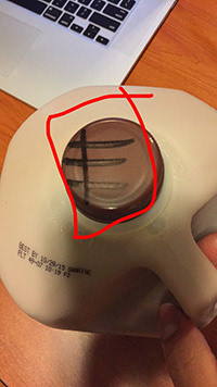
This is what I had to start with. I took this into photoshop to begin cutting out the shape.
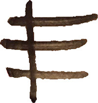
This is what it looked like after I cut it out with the quick selection tool in photoshop. It needed to be cleaned up, so i transferred it over to illustrator.
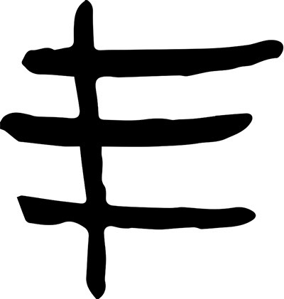
I live traced the object and then traced it with the pencil tool so I would have a shape instead of a picture.
I filled in the shape I made with black and then it started looking more like a logo. Now it was time to make it look cool.
I filled in the shape I made with black and then it started looking more like a logo. Now it was time to make it look cool.

The drop shadow at first was an accident, but it turned out to be the greatest accident in this project. I turned the original shape white so all you could see was the negative space. this is one of my favorite variations I did with the E.
I took a design that I had made previously and put the E over it with a clipping mask. This made for a really interesting and eye-catching logo.

This ended up being the logo that my customer chose to use. It is very simple but extremely original. A hand drawn logo, turned digital.